I took lots of potential photos that I
could use for the front cover, contents page and my double page spread.
However, it is not appropriate to use all of these images in my magazine,
therefore, I had to come to a conclusion of what images I wanted to use for
each element of my magazine and which images I did not want to use.

I decided not to use this image in my
magazine because the lighting doesn't catch the reader’s attention and wouldn't
look very good on the cover of a magazine as it doesn't stand out to catch the reader’s
attention.


I decided to use this image on my double
page spread because I wanted to add something different to my double page
spread. To do this, I added three images to the right side of my double page
spread. I liked that the lighting used made the model stand out from the
background and the Props used were not used in any other images throughout my
magazine.


I decided not to use the images above in my
magazine because the models pose didn't conform the codes and conventions
of other POP magazines and didn't justify who she is as a person. Also, this
lighting in the image isn't very good and has a dark shadow going around the
model which wouldn't make the model stand out to the reader.


I decided not to use the two images above because the model is not
looking directly into the camera, which is not the camera angle that I wanted.
I wanted an image where where the model is looking directly into the camera as
this allows me to grab the readers attention and make the magazine look more
inviting.

I decided not to use this image in my magazine
because if I used it as one of the background images on my front cover, there
wouldn't be much room to write around the image as well as allowing the image
to stand out. In addition to this, the shadow behind the model, doesn't allow
her to stand out as much as she could and this wouldn't grab the reader’s
attention.

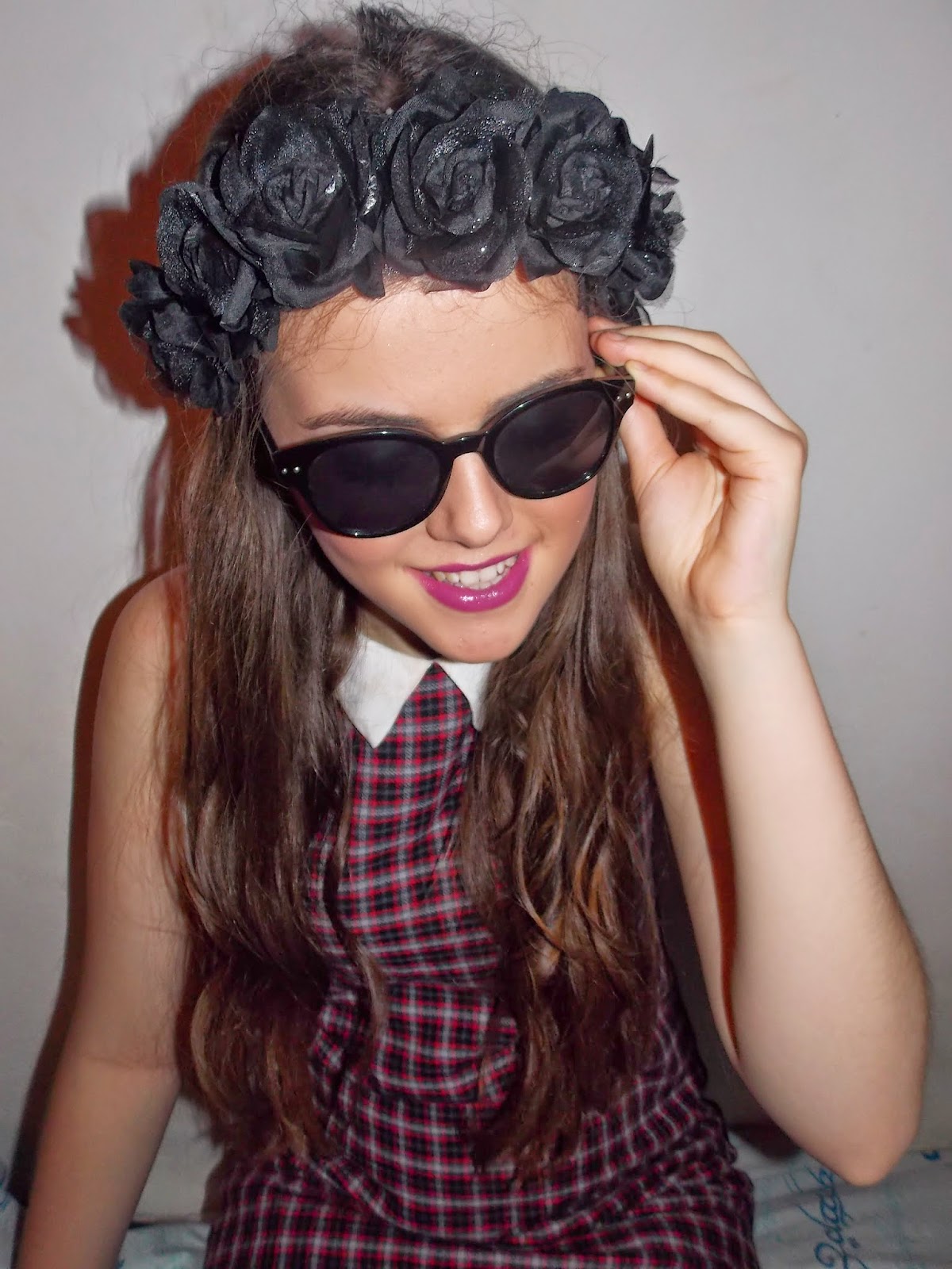
The reason I didn't use this image on my double page spread, contents
page or the front cover of my magazine is because although the lighting is good
and focuses on the models face, the mise-en-scene isn't represented very
clearly in the image (models clothing and props) which wouldn’t make the
magazine very interesting to look at.
No comments:
Post a Comment