Monday, 10 March 2014

Double Page Spread First Draft & Feedback

Before, I start to create Double page spread, I need to ensure that I have an idea of where I want everything to be placed on my double page spread and that I follow the rules and conventions of a normal magazine cover. 

When designing the draft of my magazine, I had to think about:
  • Where I am going to place the content
  • Where I am going to place any images
  • Text fonts/sizes and colours
  • How I am going to edit any images
  • What content I am going to include (interviews etc)

I am going to use this draft to help me create my Double page spread and to ensure that I know where I am going to place everything on the page.

 My  double page spread draft:

Feedback:

I like the idea of images going along the top of the page and being black and white and the rest of the page being in colour.

I think you may need to make the headline is a bit bigger or you could put it next to the main image on the left hand side of the page.

I think it is also important that you include page numbers as this is an important convention of a magazine.


Again, you need to make sure the colours and text styles are consistent throughout the magazine. 

Contents Page First Draft & Feedback

Before, I start to create my contents page, I need to ensure that I have an idea of where I want everything to be placed on my contents page and that I follow the rules and conventions of a normal magazine cover. 

When designing the draft of my magazine, I had to think about:
  • Where I am going to place the content
  • Where I am going to place any images
  • Text fonts/sizes and colours
  • How I am going to edit any images

I am going to use this draft to help me create my contents page and to ensure that I know where I am going to place everything on the page.


Below, you will find my draft:


Feedback:

Editor’s letters are normally used in music magazines aimed at younger audiences and as yours is aimed at older female teenagers, you may not need to have one in your magazine. You could use the space to allow the main image on the contents page to stand out a little bit more.

The layout of the text on the left hand side of the page next to the main image is appropriate and unique to the magazine.

Make sure the text used for the masthead/title of the contents page is bold and stands out so that the audience are aware that it is a contents page.

Ensure the colours used for the text and editing of the image are the same ones that are used on the front cover, this makes the magazine look professional and makes it more recognisable to the target audience.

Friday, 31 January 2014

Front Cover First Draft & Feedback

This is the first draft of my music magazine. This draft shows where I am going to place everything on my magazine. Before I started my draft, I had to research different front covers of magazines, this gave me an idea of how a magazine cover should be presented as I looked at other pop magazines and my genre is pop, it helped me to understand what I need to do to ensure that my magazine appeals to my target audience. Once I had researched and I had an idea of how my magazine cover should be set out, I could start creating a draft. This research helped me to decide where I am going to position each different magazine convention on the magazine cover. When designing this draft, I had to think about the different conventions of a magazine cover.

The conventions I included on the cover of my magazine included:

Banner: Front page headline which goes across the full width of the page.
Splash: Main story of the front page accompanied with the headline and a photograph.
Masthead: The title of the magazine at the top of the page, it will be big and bold. 
Headline: The main heading and the biggest font and related to the main story in the magazine
Date Line: Shows the date the magazine has been available from/ issue number
Cover Lines: summaries of the most enticing features and articles which are inside the magazine
Barcode: Shows the price of the magazine underneath. 

I first started with the banner, as this is allocated at the top of the magazine cover. Underneath the banner I placed the masthead of the magazine. This shows the titles of the magazine and has to stand out to catch the reader’s eye. In the centre of the page, I placed the main image, this image has to relate to the main story and must stand out from everything else on the page, it had to be bold and interesting. Now I had positioned the main compositions of the magazine cover on the page, I could work around these and place my barcode, cover lines and date line etc.


Front Cover First Draft:

Feedback:

Your first draft has been analysed very well, I think you just need to think about a few things when you're actually creating your front cover, using Photo Shop.

I think you need to ensure you use your front cover research and research a few other POP magazines, and see what conventions they use to attract their target audience. If you are only using one main image, you need to justify why you're only using one image.

What content are you going to include in your cover lines, you need to make sure you don't include to much information as this won't allow the main image to stand out. You also need to ensure that the font styles you use are consistent throughout your magazine to ensure that the magazine looks professional.


Are all of the buzz words necessary or do you only need to include a few? Also, make sure that the content included on the banner is necessary to the magazine, if your genre is POP; you need to make sure that the content on the banner is related to POP music. 


Sunday, 26 January 2014

Barcode


I believe that there are many reasons why a barcode is an important feature of a magazine cover. A barcode makes it easier for the company producing the item to track and store information about goods. They provide many advantages as by having a barcode it means that you don't have to manually enter the information.
 
The barcode isn't just an advantage for the company producing the magazine, but it is also an advantage for the customer. By having a barcode on a product or in this case, a magazine cover, it allows the customer to see the price and the name of the product.
To create my barcode, I used http://www.barcodesinc.com/generator/index.php?nav=hdr. The barcode includes the price of the magazine, which is £2.99. This is because it is a very reasonable price for my target audience. This is reflected in my survey where 90% of people said that they would pay up to £2.99 for a magazine. 

Below you will find the barcode for my magazine:

Double Page Spread Research & LIIAR Analysis

NME-Double Page Spread Research:


NME Double Page Spread Research:


Both of the double page spreads are from NME magazines.

L- Media Language/ Conventions (see images above)

I-NME is published by IPC media.  IPC,  is a very well knowing and leading magazine publisher. NME was first published in March 1952, and there has been a new issue of the magazine out every week, ever since. IPC became an established building house in 1963. IPC are the parent company of Time INC and are located in London.  NME is the longest published and most respected weekly in the world. IPC is the UK's leading consumer magazine publisher and IPC works in partnership with its consumers, advertisers and business partners, to deliver innovation and creativity. IPC has award winning portfolio websites and they reach over 25 million users each year. NME is published by IPC inspire. IPC inspire has a wealth of leisure brands, as well as lifestyle brands such as NME. NME is a unique media platform as it reaches over 1 million music fans every week. Every month NME celebrates all that is new and old in rock music. 

I- New music express is released once a week. They aim to promote bands that aren’t yet popular but at one stage will be popular and they like to promote this before they are popular and so that they are ahead of everybody else. Both double page spreads stick to the colour scheme of NME, which shows that all of their magazines are kept consistent (Red, White and Black), this makes it easy for the audience to recognise the magazine when they see it. NME is a music magazine. The magazine mainly consists of pop and rock magazine, which you can tell from looking at this double page spread. NME focuses on artists, such as Lily Allen, that were big in the past and allows people to see how they were successful in the past. NME is now one of the world’s biggest music sites, with over 7 million users per month. Every if people have never heard of the band on the second double page spread, they are still likely to buy the magazine as they have an interest in this genre of music. NME are very Unique as there aren’t many magazines that promote this genre of music, which makes people more interested in reading their magazines as they are different to everyone else and ‘stand out from the crowd’.

A- NME is mainly targeted at teenage boys who are interested in this genre of music. The magazine is aimed at predominantly British people and 70% of the readers are men and the other 30%  are women. However, some teenage girls may be interested in the magazine, depending on that genre of music they like. IPC, describes NME as having a male target audience. The magazine mainly focuses on today's music. Also, because they use artists and groups from the past in their magazines, it will make people interested because teenagers won't really be aware that much about groups and artists from the past and how successful they were. The IPC website states "NME.COM is the world’s biggest standalone music site serving an intensely engaged audience of 16-24 year olds. A copy of NME normally costs £2.30 and has and an issue is released every week.

R- On the first double page spread, it feature Lily Allen and the second, features Florence Walsh. The pages reflect a house style, using a particular colour scheme (red, black and white). There is only 1 image on each of the double page spread which takes up most of the space because it is an older target audience; you don’t really need lots of images to attract them to read the magazine. The image takes up most of the page and the text is in the bottom corners of the pages, so that the first thing the reader sees when they look at the double page spread is the image and is makes them want to read on with the page. The most important details on the double page spread are in bold. 

Contents Page Research & LIIAR Analysis

Top of the pops- Magazine Contents page:


L- Media Language/ Conventions (see image above)

I- Top of the pops magazine is published by Immediate Media Company. BBC top of the Pops magazine is published by immediate media company London who are limited under licence from the BBC worldwide who help to fund the BBC. BBC Top of the Pops magazine is the biggest-selling teen lifestyle title in the market, focusing on the world of celebrities. The magazine features the latest fashion, song lyrics, quizzes, celebrity gossip and the magazine brings readers exclusive and exciting content every four weeks. The magazine was launched in February 1995. The magazine is a supplementary magazine for the TV show Top of the pops; however, the TV show was cancelled in 2006.  Immediate Media Company is an award winning special interest content and Platform Company. They are one of the biggest consumer media businesses in the UK and the third largest magazine publisher in the UK. Immediate Media Company sells over 70 million magazines every year and reaches 22 million people online every month. Consumers engage with their 32 ecommerce (enable them to sell their magazines online) websites, which receive 30,000 transactions a month. Immediate Media Company combines their reputation for editorial quality with an integrated approach to help them to deliver multi-platform content.

I- The magazine features the genre of pop music and their aim is to reach their target audience and to get them to read as many magazines as possible as well as wanting them to enjoy reading the magazine. It wants to keep its audience up to date with the latest music. This is reflected in many different ways throughout the magazine. One way that it is reflected is through the colours, image and text used across the front cover, these colours and images represent a girly and pop outcome which is what the magazine is aiming for.

A- The target audience of Top of the Pops is young girls, between the age of 11 and 25, with a keen interest in pop music. 87% of people who read the magazine are girls and the other 13% are boys. This age range is reflected through the price of the magazine, which is £2.40, as well as the content that is included in the magazine. The price of the magazine is very important, especially for their target audience, as they do not have a personal income, so depend on parents/guardians to fund them, so the price of the magazine must be made affordable for everyone. They are accessible through all kinds of media (online and through a magazine), so it is important for them to include as much as they can to maintain its readers. The style and colours of the magazine make the appearance friendly to its young readers. The magazine also gives away free gifts and posters, which would attract the target audience. 

 R-Top of the pops magazine promoted the kind of artists that would appear on programmes such as Friday download, which are aimed at people between the ages of 11-14. The pages seem to reflect a house style, using a particular colour scheme, which gives the magazine identity. The varied use of images allows contrast, and shows the readers of the magazine that the magazine isn’t just about music, but it is also about other types of media too, which reflects the BBC being a multimedia corporation. Contents page is spit into boxes and highlight the most important details on the contents page which gives the reader less information to read. These highlighted details will also be relevant to the images.


 Q-Magazine Contents Page:


L- Media Language/ Conventions (see image above)

I- Q magazine is published by Bauer Media Group. Bauer media group is Britain's largest privately owned publishing group. The Group is a worldwide media empire and they offer over 300 magazines in 15 countries. Bauer Media is a multi-platform UK-based media Group which consist of many companies collected around two main divisions, these are Magazines and Radio and they are widely recognised innovators. Bauer media group say “Each issue will include a balance of bands and scenes to guarantee that we’re providing for our readers’ need for variety and their passionate appetite for their favourite bands as well as their desire to be introduced to new music within our world. “They always ensure that everything they produce is suitable for their target audience. They always focus on the biggest things that are happening in the world each week. Bauer Media currently spans over 80 influential brand names. The first issue of the magazine was published in October 1986 and has been released once a month ever since. 

I- Q is a popular music magazine published monthly in the United Kingdom. There are many beliefs and values that the publisher of Q want the readers to see. The first thing that you can see is that they want to be an upmarket screen as their magazine is priced at £4.50, this also affects their target audience as this price is not going to appeal to everybody. The contents page features a very famous artist, which suggests that the magazine is very popular otherwise they wouldn't be used to promote the magazine. They print their magazines onto glossy, high quality paper, which shows how professional they are and how well-thought their design is. The Q brand has developed a worldwide reputation as a trusted and premium quality voice of musical authority among fans, musicians and the music industry. Everything that Q does, they aim to do for their readers. 

A- The main target audience, is between the age of 20-40, this is all due to the high cost of the magazine because people between the ages of 11-15, don’t really have a personal income so rely on parent/guardian support and may resort to a different magazine which they are more interested in reading whereas older people have paid jobs so can buy the magazine. Furthermore, the artists and models featured on the contents page of the magazine are of this age and this would therefore appeal to them, so they would purchase it to find out more about these people. The magazine isn’t aimed at a specific gender, which is represented through the neutral colour scheme, showing that it would appeal to both genders male and female.

R- The band featured on the front of the magazine are of the same age as the target audience. The pages reflect a house style, using a particular colour scheme (red, black and white). There are only 2 images because it is an older target audience; you don’t really need lots of images to attract them to read the magazine. The most important details on the contents page are in bold. 

Monday, 20 January 2014

Justification Of Images

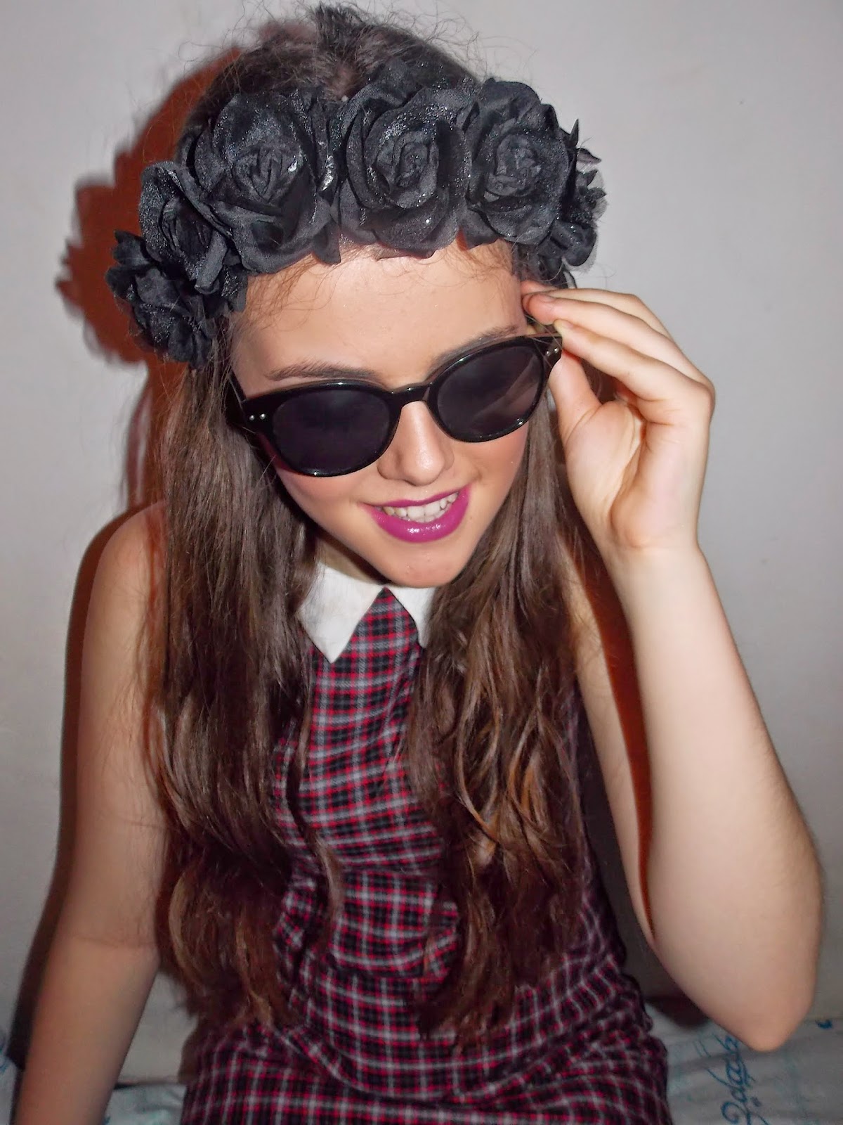
I took lots of potential photos that I could use for the front cover, contents page and my double page spread. However, it is not appropriate to use all of these images in my magazine, therefore, I had to come to a conclusion of what images I wanted to use for each element of my magazine and which images I did not want to use. 


I decided not to use this image in my magazine because the lighting doesn't catch the reader’s attention and wouldn't look very good on the cover of a magazine as it doesn't stand out to catch the reader’s attention.


I decided to use this image on my double page spread because I wanted to add something different to my double page spread. To do this, I added three images to the right side of my double page spread. I liked that the lighting used made the model stand out from the background and the Props used were not used in any other images throughout my magazine. 


I decided not to use the images above in my magazine because the models pose didn't conform the codes and conventions of other POP magazines and didn't justify who she is as a person. Also, this lighting in the image isn't very good and has a dark shadow going around the model which wouldn't make the model stand out to the reader.

I decided not to use the two images above because the model is not looking directly into the camera, which is not the camera angle that I wanted. I wanted an image where where the model is looking directly into the camera as this allows me to grab the readers attention and make the magazine look more inviting. 


I decided not to use this image in my magazine because if I used it as one of the background images on my front cover, there wouldn't be much room to write around the image as well as allowing the image to stand out. In addition to this, the shadow behind the model, doesn't allow her to stand out as much as she could and this wouldn't grab the reader’s attention.


The reason I didn't use this image on my double page spread, contents page or the front cover of my magazine is because although the lighting is good and focuses on the models face, the mise-en-scene isn't represented very clearly in the image (models clothing and props) which wouldn’t make the magazine very interesting to look at.