Sunday, 19 January 2014

Planned Photo-Shoots

Item/Model
Shot type/angle/ distance
Macro,
Flash and Lighting

Background
Positioning on front cover/TOC
Details of editing
Beth Hayes
 Mid-shot level
Against a white background. The flash is required in this image to ensure that the image is kept looking professional and the image is clear.
Against a white background, this ensures that the main image and the text on the front cover stands out against this white background.
  The picture will be the biggest feature on the page and will be placed in the centre of the page.
I may edit some of the lighting on Photoshop to ensure that the models face isn't too bright and I might also change the background using Photoshop if I don’t like what the pain white background looks like on the front cover.
NO PROPS.
Beth Hayes
Close up of her face
The flash will be on but the camera will be far away and zoomed in as if you go too close to her face with the flash, it will come up to bright when the photo is taken. I have to make sure the camera is at least 1 meter away to prevent any exposure.
The image will be taken against a white background; however I might change the background of the image using Photoshop at another time.
The picture will be the biggest feature on the page and will be placed in the centre of the page.
I may have to turn the brightness up and down depending on what the image looks like on Photoshop. I may also change the background if the text doesn’t stand out against it.

NO PROPS.
Beth Hayes
High angle shot
The high angle shot will be focused on the face and the model will be looking into the camera, therefore the flash needs to be on to ensure that the models face can be seen as clear as possible.
The image will be taken against a plain white wall. However, you won’t really be able to see the background as the focus will be on the models face due to it being a high angle shot.
The picture will be the biggest feature on the page and will be placed in the centre of the page.
I may have to turn the brightness up and down depending on what the image looks like on Photoshop. I will also put a focal point on the models face.

NO PROPS.

My Photos


Shoot Date: 24/01/14

My Reason for having no background and just having a plain white background is because, especially for a POP magazine, where you want the artist/model to stand out, I believe that having a bright coloured or location as a background will take away the whole focus of the actual artist as a person and the attention won't be on the face of the model which is the first thing that you want the reader to see. Also, from researching other POP magazines I realised that there is no pop magazines that have a location as their background, they either all have a plain white background or a colour to match their house style. A plain white background not only allows the reader to focus on the model but makes the magazine look more professional like the photo's have been taken in a studio. This also ties in with my reason for having no/very minimal Props in any of my images. The only props I have used throughout my whole image is an Iphone, which the model is holding in one of the images, a flower crown, which the model is wearing in every image and sunglasses which the model is wearing in a few images. This is again because I didn't want props to take away the focus of the main artist, I wanted the whole focus of the magazine to be the model in the image.

Research of Poses

Whilst analysing magazine from covers for NME and Karrang, I realised that most of their shots are very simple medium close up shots of all of the models, therefore only showing their shoulders upwards. Most of the models on the magazine from cover also had very serious faces which depends on the headline and genre of your magazine, this will be different for every magazine, which is why the pose for the main image is a very important feature of a magazine front cover.


This front cover of kerrang has the 3 models staring directly into the camera and it is a medium close-up shot with only their faces showing. One thing i really like about the main image in this magazine is that it goes with the headline "we've made the album of our lives" which shows how serious they are about the album and how shocked they are as the on of the models on the right has his mouth wide open. Also, the clothing that the models are wearing are quite simple so that the focus is on their facial expressions. However, they are wearing all black/grey clothing and this represents the rock nature of the magazine. 


The front cover of this NME magazine is of Lily Allen. Again, the title of the magazine goes with the bold headline "Lily Allen-Takes on the world" with the white background the main focus is on the model in the main image. Her facial expression is a very serious one and her clothing is again very simple with the focus being on Lily Allen's face. It is a medium close-up shot only showing from the shoulders upwards. 


Whilst looking at the poses of top of the pop magazines (aimed at teenage girls), I noticed that all of the models look into the camera lens, ensuring that they are the main focus of the magazine and that they catch the readers eye. Also, both of the magazines have white backgrounds so that the whole focus is on the model and to make the magazine look more professional. All of the shots are mid shots from the shoulders upwards which makes the models face clear to see and allows the audience to understand who they are when they first look at the magazine cover. The clothing they are wearing in the photos, aren't too bright and outgoing, otherwise the audience would just focus on clothing and the writing around the model rather than the image of the actual model. 


When researching Billboard, I discovered that all of their magazines have a similar house style. As well, as top of the pops, all of their models look into the camera, allowing the audience to focus on the main model. There is a brighter light on the models face puts the focus on her face. This ensures that when the reader first looks at the magazine, they recognise the model straight away and realise how popular they are.
 
There will be one main model for the main image in the centre of the page for my magazine.

Final Decisions

What music genre and why? 


The music Genre that I have chosen to do is POP. The reasons I chose POP as my genre, is because:


·     There are lots of new and upcoming artists and bands that don’t feature in magazines, but people want to see them in magazines and know more about them. This means that all other POP magazines, feature popular well known artists and bands in their magazines as they know that people will like them and they will therefore be successful. I believe that there is a gap in the market for POP magazines featuring new artists and bands and this will allow me to develop a magazine with new artist that other magazines don’t go into much detail on.

·     It is one of the most popular and well-known music genres in the world, which means that this genre will appeal to a wide range of people.
·     I am interested in this style of music, therefore because I am aware of everything a pop magazine includes and what the style of music is like, this will be very beneficial, when I am creating the media product and it will allow me to complete this task to the best of my ability as I know about this style of music.
·     My questionnaire analysis showed that most people are interested in this type of music (65%). This will also link in with my target audience, if the majority of people that took my survey were girls; it tells me that most girls who took my survey are girls.
·     Therefore, because people are interested, it will attract more readers, rather than doing a magazine on Jazz that people aren't interested in as my survey showed (0%) of people are interested in Jazz.
·     People who read POP magazines like to keep up to date with the latest music and news, therefore, the content included inside this magazine will have this, which many others POP music magazines don’t have.
Who is your target audience and why?

I have chosen to aim my magazine at a predominant audience of females between the age of 15 and 19. This is because from research, I can see that this age range are people who are most likely to go to concerts and keep up to date with the latest music and who would be most likely to listen to this music, whereas an older person may be more interested in listening to other genres of music, so young people would be more interested in listening to pop music. This is also reflected in my survey because from my survey analysis, I can see that the majority of people who are interested in POP music range from age 16-19, this allows me to see who my magazine would most appeal to. Also, my survey showed that most girls are interested in pop rather than boys. Although, there is already a lot of competition in the market for POP magazines, from doing research, I believe that a lot of these magazines are aimed at a younger target audience and there isn't as many POP magazines open to older teenagers. I also believe that this is an appropriate age range because if you look at other POP music magazines such as ‘top of the pops’ which is aimed at a younger audience, the content inside these magazines aren’t just based on music, they include things such as fashion, which doesn’t really conform the codes and conventions of a ‘music magazine’, my magazine will be entirely based on music.

What research have you done to provide evidence for your decision?

My questionnaire helped me with a lot of the decision when deciding what magazine genre to do and what age range and what gender to aim the magazine at, this is because my survey results showed that 65% of the people who took my survey were interested in POP music. More than 70% of the people who took my survey were between the ages of 15-18. My survey also shows that people want to see a new magazine at least once a week, therefore there is a gap in the market, and if there isn't one each week, the information that they do find out about new pop music is always going to be a week late, which shows there is a gap in the market for this style of magazine. Pop music has an aim to “an aim of appealing to a general audience, rather than to a particular sub-culture or ideology”. It is aimed at most people and there isn't a magazine that normally does this. From my research, I can see that Pop magazines such as blender and top of the pops, normally feature more than one artist and focus the whole magazine on lots of different artists which can sometimes make the page look like it has too much content and too many images, which may make a reader choose a different magazine. Therefore I think it is important to have a pop magazine that just focuses on one artist. Although, I do understand how important it is to feature other artist and bands as this means that if the reader doesn’t like the artist featured in the main image, they might be interested in other artists inside the magazine. However, if you feature other artists, there does not need to be a picture of every artist that is going to be featured inside the magazine on the front cover as this can make the cover of the magazine look very cluttered.

Potential names for my magazine?

Most POP magazines have very unique and unusual names, this is very important in allowing your magazine to be recognisable to your target audience and to also allow the name of your magazine name to stand out among other POP magazines. To come up with potential names for my magazine, I used a thesaurus (www.thesaurus.com) and typed in ‘POP’. When you think of ‘POP’ music, you think of loud, popular music, when researching potential names, I kept in mind that it is important to correlate the name of the magazine with the style of music that the magazine is going to be based on. When I types in ‘POP’ to the thesaurus, some potential names for a magazine that stood out to me, include:
  • Clash
  • Miss Pop
  • Loud
  • Roar
  • Explosion
  • Snap

The final name that I have chosen for my magazine is 'Miss POP', although this wasn't one of my ideas at first, I believe that is effective and stands out by linking in with my target audience, which is females ages 15-19. It also allows the audience to be aware of the genre of the music magazine, just by reading the name of my magazine. 

Potential artists to be interview for my magazine:

When researching other POP magazines, I looked at many of the artists that are featured inside these magazines and decided of some potential artists for my magazine. Some of the people that I am going to feature in my magazine are:
·        Beth Hayes
·        One Direction
·        5 Seconds Of Summer
·        Little Mix
·        Taylor Swift

What other magazines influenced your thinking?

To get some ideas about what I could include in my contents page, I researched many different music magazines that had the same genre as mine, which is pop. Magazines such as Billboard, top of the pops and bliss all influenced me and gave me ideas that I can incorporate into my magazine. Although, top of the pops is for a much younger audience compared to my target audience, the magazine still gave me ideas about what I could include in my magazine, such as what images of pop groups, Interviews and competitions etc. I got more ideas from pop magazines such as billboard and bliss as these are aimed more of an older teenage audience so I was able to gain more from researching these magazines. When doing the research about these pop magazines, whereas top of the pops is for a younger audience so has lots of images on the front cover, bliss and billboard always only feature one person and therefore only have one image on the front as you shouldn't need to have lots of images on the front to attract an older teenage audience. I also found out that the models on the front of the magazines, such as pop groups and artists such as Justin Bieber, One Direction and Taylor swift all wear ordinary clothes, this is due to the fact they are so popular, they do not need to be in bright clothing to stand out on the magazine cover as people instantly know who they are and want to read the magazine.  Also, none of the photos taken of the models have a certain background. Most of the backgrounds that are used in the background of POP music magazines are white backgrounds. This insures that the model stands out from the background and allows the pictures to look like they have been taken in a studio, as well as allowing them to look more professional. I also got ideas on how I can layout my front cover and contents page with the main image in the centre and the rest of the text and of the magazine surrounding the image. 

How much are you going to charge for your magazine and why?

I am going to charge £2.99 for my magazine, as this is an affordable sensible price for my whole target audience. I also based this on the survey that I done which shows that my target audience would pay up to £2.99 for a magazine. Most music magazines cost between £4 and £6, therefore, I believe have a lower price will allow me to stand out against competitors of this genre of music. Also, because my magazine will feature new artists whereas other magazines feature popular artists, I need to ensure that it will be successful, if it is a high price; people aren't going to buy it. 

Institution
I think that the best institution to distribute my media product is ‘Immediate Media Company.’ Immediate Media Company is a combined publishing house; it is combined with Origin Publishing and BBC Magazines. The publishing company started distributing in 2011. It publishes over 50 magazine titles including 23 BBC Worldwide titles which have a long term licence as well as publishing over 30 websites.  Immediate Media Company is one of the most popular distribution company's and they are one of the biggest consumer media businesses in the UK and the third largest magazine publisher. Immediate Media Company is an award-winning special interest content and platform company. Their aim is to make everything good quality. People read their content across 36 websites, 58 magazines and they reach over 70 million people. The only music magazine that ‘Immediate Media Company’ currently distributes is ‘Top of the Pops’ which is aimed at a much younger teenage audience, whereas mine is aimed at an older teenage audience. My reason for choosing Immediate Media Company to distribute my magazine is that although they already distribute one POP genre music magazine, this is aimed at a younger audience so have nothing like my magazine. It is also beneficial for the company in many different ways as it allows the company to open up their media products to a wider range of people. Also, my magazine will differentiate the company from others as it only features on artist whereas other magazines normally feature more than one artist.
Camera/Models
I have decided that I am only going to have one model on the cover of my page and that I will only have one main image on the page. In total, I am going to have 6 images; this will consist of one main image on the cover, contents and double page spread as well as three other images that will go along the top of the double page spread. The camera that I will use to take my images is a NIKON L81o.
What content will be on your front cover, Table of contents and your double page spread?

Front Cover:
I have decided to have only one main image on the cover of my magazine. My reason for only having one main image on the cover of my magazine is to ensure this model stands out as much as they can and to make the magazine look more professional. I have also decided to have a plane white background of my magazine to conform the background of a typical teenage pop magazine, this will also ensure the model stands out against the background and will catch the reader’s eye. The magazine conventions that I am going to use on the cover of my magazine are a date line, headline, banner, and masthead and cover lines and a bar code. I need to ensure that the colours I use on the cover of the magazine are used throughout my contents page and double page spread, this means that every time the reader looks at one of these magazines, they will recognise the colours used and this will also help me keep to a particular house style for a magazine.

Table of contents:
A contents page tells the reader all of the content that is included in the magazine and allows them to find out what page this content is included on. To help me decide how to layout my contents page and what content to include, I looked at billboard, top of the pops and blender, which are all POP music magazines. Blender only uses one model on their contents page so I decided to focus more on this contents page to help me. I have not decided to use any secondary images because I want the magazine to feature only one main model, otherwise if I use too many images the text that is on the page won’t stand out to the readers and they will just focus on these images rather than the text on the contents page.  I am going to have one main image to the left-centre of the page and all of the text going around the right side of this image, like the blender magazines featuring just one artist/band. All of the page numbers will be in a different colour to the rest of the text on the page and I will have the most important pieces of font in bold text so that the reader doesn't have to read every word on the page to find what they are looking for, which makes it more convenient and will appeal more to them. 

Double page spread:
On my double page spread, I will have one main image on the left hand side of the page, as well as having 3 black and white images going along the top of the right side of the page, above the text. My double page spread will be an interview about the artist that has featured throughout the magazine, which will carry in from the headline that I use on the front cover of my magazine. The interview will be about the new upcoming artist. Before the interview, there will be a smaller piece of text introducing the artist and who she is. I need to ensure the colours that I use are consistent and match the rest of the colours that I have used throughout the magazine. 

Images that I will use for my front cover, table of contents and double page spread:

Front cover:


Table of Contents:


Double Page Spread:


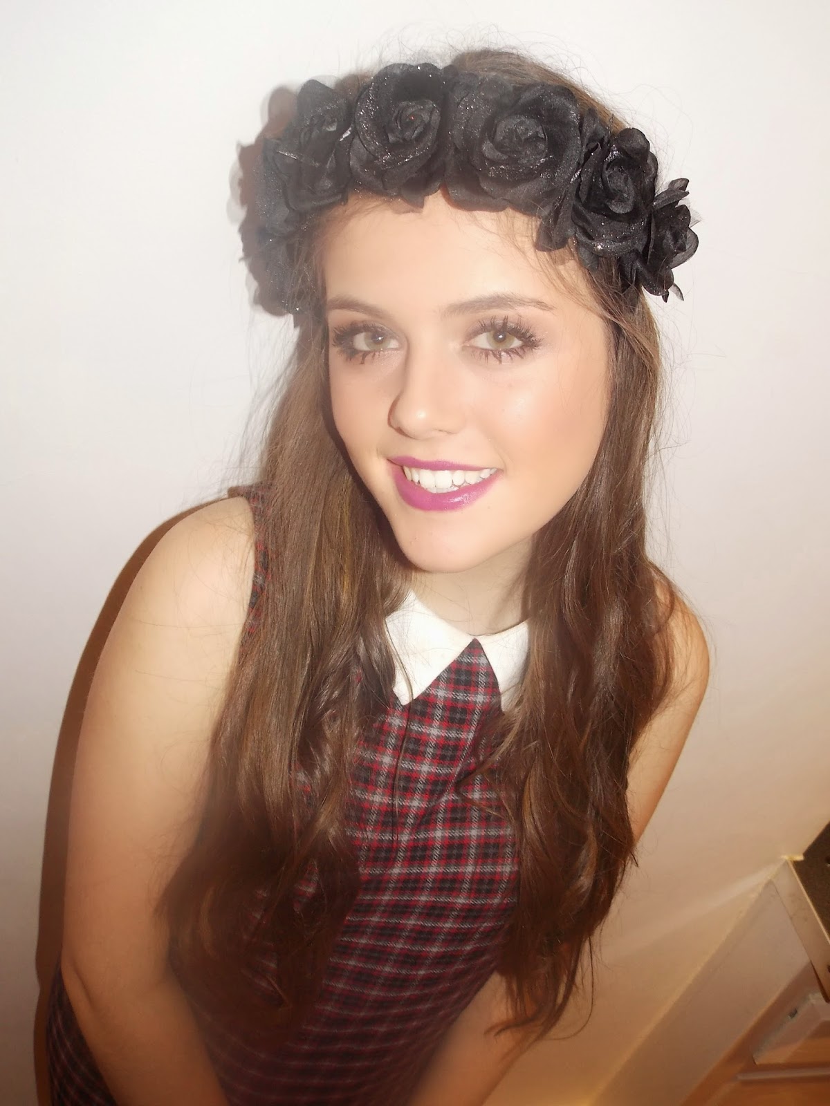
The reason I used these image for the front cover, double page spread and contents pages of my magazine is because the models poses makes her look confident. The front cover image and double page spread images are medium close up shots showing from the models shoulders upwards and she is looking directly into the camera, making the magazine look more inviting and welcoming. The pose also makes her look confident as she is smiling into the camera. Furthermore, the lighting in the images all make the model stand out and isn't too bright. You can also clearly see what the model is wearing as well as the props used in the image (flower crown).

How my images conform other POP magazine images:


Survey Analysis

Question 1)

From Question 1, I am able to see that the majority of people who took my survey were between the ages of 15 and 16 and some were 17 and 18. This allowed me to decide what my target audience was along with finding out what genre this age range preferred. This is a big part of the target audience, because if you don't know who your target audience is, then it is hard to design your magazine to suit a specific age range. 

Question 2)

The second question showed me that the majority of the people who took my survey were Female. This ensured me that I had to be very careful when deciding my target audience as if I choose my target audience to be males, it is going to be very hard for me to choose what content to include what content to include in my magazine as i will have no back evidence to base my decision on if most of the people who took my survey were females.

Question 3)

Question  3 allowed me to see how much people are willing to pay for a magazine. This analysis will help me when coming to decide on a suitable price for my magazine that will also suit my target audience. When deciding a price I need to take into consideration my target audience to ensure that the price is affordable for them. If my target audience is age 13-12, it wouldn't be reasonable to set a very high price as they don't have much of an income so rely on adults. Whereas, if I choose my target audience to be between the ages of 16-20, I could price my magazine a little bit higher as they have more of an income. 

Question 4)

Question 4 tells me that people would want a new magazine to be released once a week. This means that they would be able to keep up to date with the latest new music and news, as twice a week would be a bit too often and they could end up seeing the same thing over and over again and it will get to the stage where it would no longer interest them to read the magazine. It is vital to ensure that the content in a magazine is not repeated, as this won't be very beneficial for the distributor of the magazine because people will no longer want to buy the magazines as they are reading the same thing every time they buy the magazine, which will not appeal or stand out to them.

Question 5)

Question 5 tells me what people look for in a music magazine. From this I can see that in a music magazine, most people want to see concert information. This survey will help me when i put the content in my magazine as it allows me to see what the target audience of my specific age range want to see in the magazine and what appeals to them and makes them want to read the magazine. The content is the most important part of the magazine, because it is what is inside the magazine that is going to interest the audience, therefore, if the content doesn't appeal to the target audience, they aren't going to want to read the magazine. 

Question 6)

Question 6 tells me what people want to see feature in a magazine. Whether it is new artist, old artists etc. The survey showed that most people like to see popular groups and artists in a magazine. This means that when I am creating my magazine, I need to ensure that I include lots of information about popular groups and artists that people want to see in the magazine. 

Question 7)

Question 7 tells me what music people are most interested in and enjoy listening to. The survey shows that the majority of people enjoy listening to pop music. This then allows me to research more into pop magazines so that I know what I specifically need to include in my magazine in order for it to be successful and make people want to read it. This also links in with the age gender (question 2 on my survey) of my magazine. It shows me that 70%+ of females enjoy reading POP magazines.

Question 8)

Question 8 shows me what music magazines people already enjoy reading. Most people enjoy smash hits. This meant that I can go and research other smash hits magazines and see what they do to become successful, what features they have on their magazine, what artists they feature and how their magazine is layed out etc. From asking this question, it allows me to do more research and analyse other music magazine that people are interested in reading and I am able to see what ideas I can get from these magazines to attract my target audience. 

Question 9)

Question 9 allowed me to see what features makes people want to buy the magazine. From my survey, I can see that the most important feature of a magazine cover is the main image and this is what people want to see and like about the image.  The main image is the first thing that people look at on the cover of the magazine, this means that I need to make sure my main image stands out to my target audience otherwise the content in the magazine is not going to interest them. Therefore, it is essential that in my magazine, the main image appeals to my target audience.

Question 10)

From question 10, I can see what ways people enjoy listening to music, this will give me ideas about what gifts and competitions I can give away in my magazine.

Music Magazine-Mood board

As part of my research for my music magazine, I created a mood-board. This mood board allowed me to gather some ideas for my magazine and allowed me to see what features other music magazines use to attract their target audience. It gave me ideas about font styles, colours, camera angles and images that I could use when creating my magazine.

As you can see from my mood board, the "masthead" of the Kerrang! Magazine that I used for my masthead has a very outgoing and distinctive masthead that is very easily recognised by the audience and unique to the magazine. All of the text used in the Kerrang! Magazines are bold and most of the text used is in capital letters, which represents the magazine having a particular house style. Kerrang! Is a Rock magazine, which you can infer just by looking at the layout of the magazine, you don't have to know about the magazine to realise that the magazine is a rock magazine. The image that was used on the front of the magazine was a rock band and they were standing in a hierarchy, showing the main singer at the front and the others in the background. The models are also looking directly into the camera, catching the audience’s attention, also implying that they are related to the main headline as they are the models in the main image of the magazine cover.


From creating my mood board, I recognised that it is very important to stick to a house style to make sure the magazine is consistent and looks professional. The main colours used by Kerrang! Are red, black and white. It is very important that they don't constantly keep changing the style and layout of their magazine as their target won't be able to recognise it and you want people to recognise the magazine so that they buy it, this is why it is important that they stick to one house style.

Front Cover Research-LIIAR Analysis


Image 1-NME Magazine Research-Conventions:


Image 2-Kerrang! Magazine Research-Conventions:


Image 3-Billboard Magazine Research-Conventions:


Music Magazine Research- Survey


Below, you will find the questions from my survey: